Dashboard
The Dashboard gives a high-level overview of your environment for a selected time range.
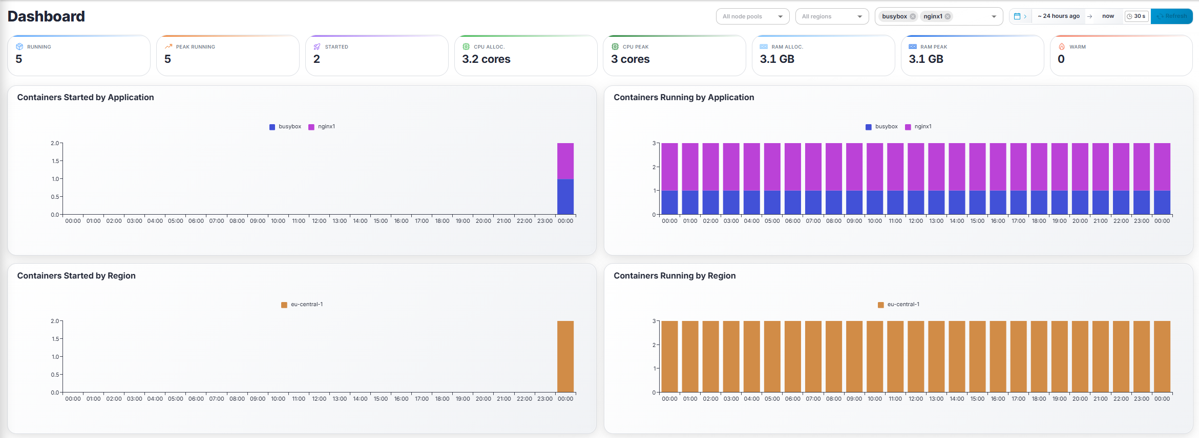
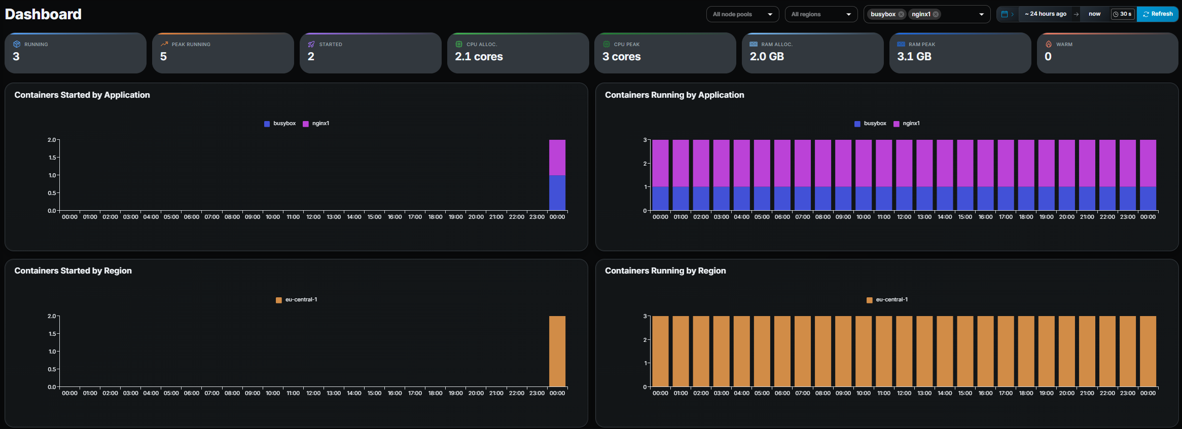
Filters
Section titled “Filters”At the top-right you will find:
- Node Pool filter — shown only when more than one node pool exists.
- Region filter — filter data to one or more regions.
- Application filter — narrow everything to specific applications.
- Date range picker — choose the time window (default: last 24 hours).
All filters apply simultaneously to the summary metrics and charts below.
Summary metrics
Section titled “Summary metrics”Eight KPI tiles are displayed:
| Metric | Description |
|---|---|
| Running | Containers currently running. |
| Peak Running | Highest concurrent container count in the selected period. |
| Started | Total containers started in the period. |
| CPU Alloc. | Total CPU cores allocated to running containers. |
| CPU Peak | Peak CPU allocation during the period. |
| RAM Alloc. | Total RAM allocated to running containers. |
| RAM Peak | Peak RAM allocation during the period. |
| Warm | Number of warm-pool containers currently pre-started. |
Charts (2 × 2 grid)
Section titled “Charts (2 × 2 grid)”| Chart | Breakdown |
|---|---|
| Containers Started by Application | Stacked bar chart, one color per application. |
| Containers Running by Application | Stacked bar chart, one color per application. |
| Containers Started by Region | Stacked bar chart, one color per region. |
| Containers Running by Region | Stacked bar chart, one color per region. |
When a chart has more than 12 series the legend is hidden to save space; hover a bar to see its label in the tooltip.
- If numbers look lower than expected, check whether a filter is active or whether your organization only has access to a subset of the data.